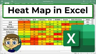
Create a Heat Map in Excel
Channel: Technology for Teachers and Students
Category: Howto & Style
Tags: color scales in excelusing color scales in excelheat maps in excelheat map in exceladd a heat map in excelhow to add color scales in excelcolor scalescreate a heat maphow to use color scales in excelconditional formatting in excel
Description: Learn how to create a "Heat Map" effect in your Excel data. This technique helps to quickly draw attention to what the data means, even at a glance. ***Consider supporting Technology for Teachers and Students on Patreon***: patreon.com/technologyforteachersandstudents Here's my entire playlist of Excel tutorials: bit.ly/tech4excel Consider saying "Thanks" by clicking the Thanks button below the video. Here's a link to the practice file that goes with the video: bit.ly/excelheat #excel #exceltutorials #microsoft365